
Minnesota Timberwolves: A New Identity for the 2026-2027 Season
The Minnesota Timberwolves pulled back the curtain on Sunday to reveal their new visual identity for the 2026-2027 season. New jerseys, a new logo and new courts: the Minneapolis franchise has embraced a deliberate return to its roots, drawing from the great eras of its history to craft a look that feels both familiar and refreshed.
The Timberwolves have officially revealed their modernized throwback rebrand, including a new logo.
An entire new set of uniforms to go along with a retro court design. pic.twitter.com/WAgpOd3kxW
— Evan Sidery (@esidery) June 7, 2026
A Tribute to the Origins, with Garnett as a Model for a Day
The « association » and « icon » uniforms feature white, blue and green colors, a palette drawn directly from the club’s inaugural 1989-1990 season. The trim revives the classic triple stripe from the original jerseys, with thick and thin lines in blue and green, while the numbers and the « Wolves » wordmark on the chest are inspired by wolf fangs. Two new details adorn all the shorts: a « Tree-M » monogram at the waistband and a row of five trees above the tag, a subtle nod to the starting five.
JUST IN: The Timberwolves dropped their jersey rebrand, paying homage to the 90s Kevin Garnett era.
🔥🔥🔥 (@timberwolves) pic.twitter.com/cD3zn3V3Xp
— Legion Hoops (@LegionHoops) June 7, 2026
The « statement » version brings back the black from the « pin trees » era, a look that has remained very popular among fans. Compared to the classic jerseys worn last season — which paid tribute to the 1998-2008 period — this new version displays the « Wolves » name outlined in bright blue and green, replacing the old black and white « Timberwolves » lettering. The pine trees return as trim, with a blue neon effect inspired by the 10,000 lakes scattered across the state.
Franchise legend Kevin Garnett took part in the teasing of this new identity by posing in each of the jerseys, adding a symbolic dimension to the event. The new logo retains the howling wolf but adopts the blue and green tones of the very first logo used from 1990 to 1996. The Wolves will also have two new courts, available in « statement » and « core » versions.
can you guess which one’s Jaden’s favorite? 👀 pic.twitter.com/Ii1K4upiXp
— Minnesota Timberwolves (@Timberwolves) June 8, 2026
A New Era After the Playoff Elimination
Matt Caldwell, president of the Timberwolves and the Lynx, explained the philosophy behind this aesthetic choice: « This franchise means something different to every generation of fans. We wanted this new look to reflect the elements fans have always been attached to, while staying true to the team and the culture surrounding this franchise today. More than anything, we wanted to create something that reflects where this organization is headed and that the entire state can rally behind. »
just $@!>%* around. pic.twitter.com/BjvWM8r4Tp
— Minnesota Timberwolves (@Timberwolves) June 8, 2026
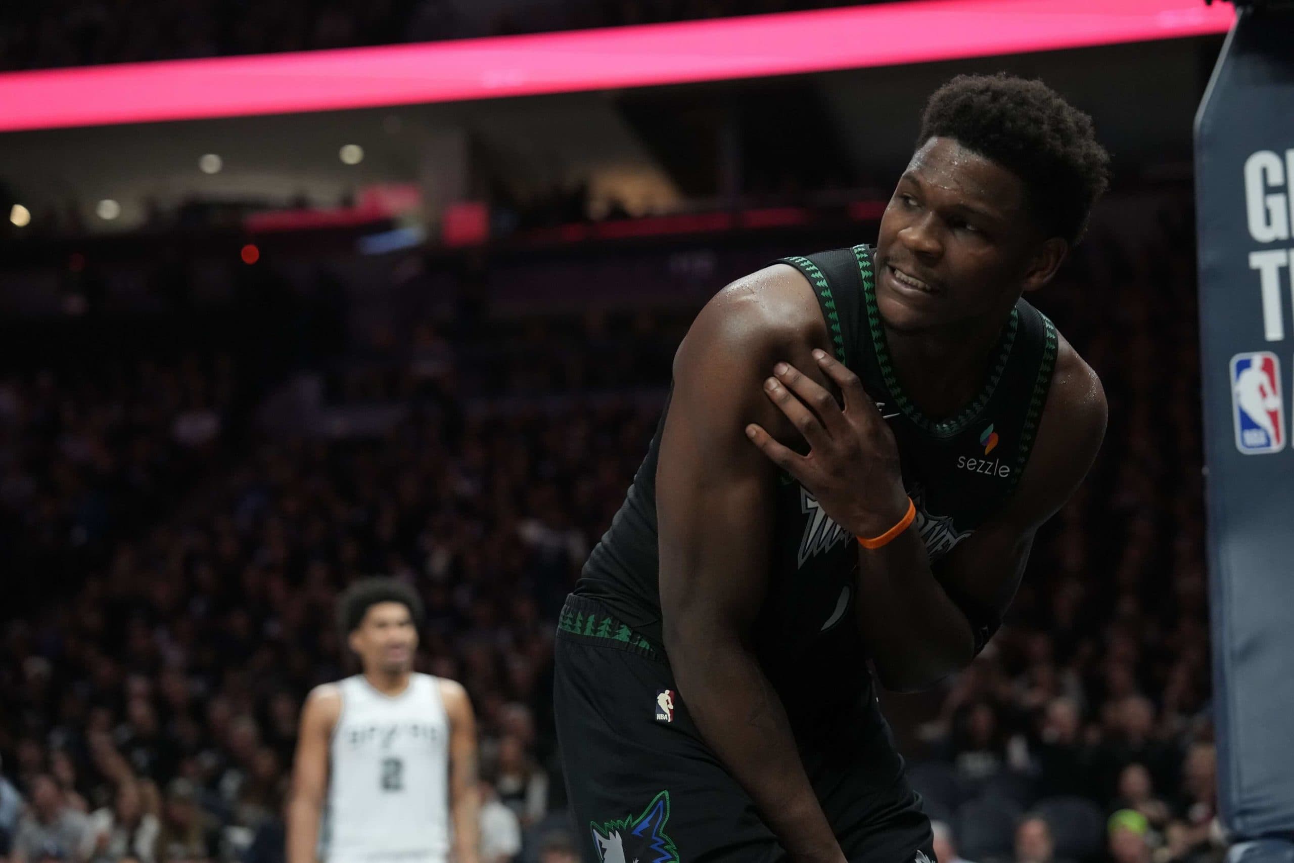
This makeover comes in a particular sporting context. After two consecutive appearances in the Western Conference Finals, Minnesota was eliminated in the second round of the 2026 playoffs by the San Antonio Spurs. Injuries weighed heavily, preventing the team led by Anthony Edwards from reaching its full potential.
The Minnesota Timberwolves now hope to build on strong foundations in 2026-2027, with these uniforms as a symbol of renewal. A first championship remains the ultimate goal for a team that has never reached the NBA Finals, despite a few glorious moments.


Comments (0)